
Malaysia’s National Independence Commemorative Logos

According to Benedict Anderson’s “Imagined Communities,” the perception of a shared history, culture, and destiny is the foundation for a sense of belonging and shared identity, culminating in an imagined community— the nation. A key idea is the role of print capitalism in forming a national consciousness. He posited that the advent of the printing press facilitated the spread and dissemination of a shared language and a standardised, homogenised communication— contributing to a sense of simultaneity and a shared national consciousness.
Anderson primarily referred to written materials such as newspapers, books, and pamphlets. This article, however, is interested in exploring the visual language. Visual materials such as posters, magazines, logos, brochures, and stamps are artefacts that have also benefited from advancements in the printing press. Based on Anderson’s notion, they would have also contributed to an imagined national consciousness and identity.
We can examine this by studying Malaysia’s National Independence Commemorative logos throughout the years.
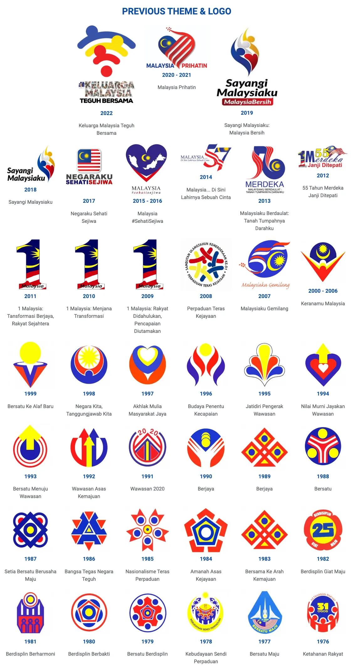
Since 1976, it has been customary to have a commemorative logo for each year’s national independence celebration in Malaysia. The purpose of the commemorative stamps is to embody the core values of Malaysia in a singular recognisable symbol, which the government wishes to celebrate as the epitome of the country’s identity and independence.
Symbolism of the Logos and Narratives
Analysing the evolution of logos reveals insights into the narratives promoted by past governments. A consistent element in these logos is the use of Malaysia’s flag colours: red, blue, and yellow. These colours carry significant meaning in Malaysia and represent the nation’s heritage and values, embedded in the visual vocabulary of Malaysians since childhood.
Symbolically, red signifies bravery, white purity, and yellow represents Malay Royalty. The combination of red, white, and blue symbolises unity between the Federal Malay States and the United Kingdom. It also signifies an agreement between Malaya and the Commonwealth countries, fostering international togetherness and cooperation.1 These colours symbolically convey our self-perception and our global image.
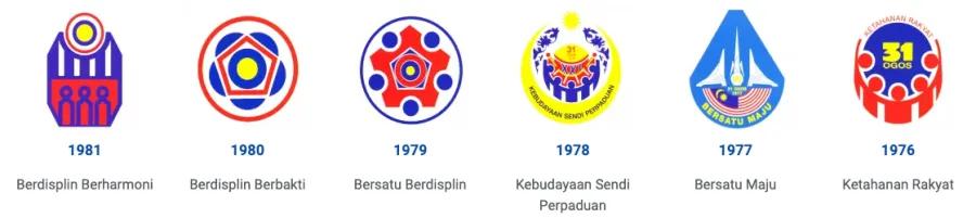
Throughout the decades, we have observed several recurring visual tropes, one prominent example being the hibiscus, the national flower of Malaysia.
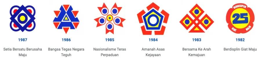
This visual motif is consistent and apparent across the logos during the 1980s. The Hibiscus, with its five petals, is said to symbolise the five National Principles (Rukun Negara), which were introduced on 31st August 1970 as a reaction to the May 13 incident in 1969.2 Additionally, the hibiscus is read as a symbol of unity, reflecting the importance of togetherness and cohesion within the nation.3
In the following years, the logos focused on themes such as “Unitedness (Bersatu)”, “Discipline (Disiplin)”, and “Unity (Perpaduan)”. The symbols reflected these themes by depicting the five petals of the hibiscus coming together, culminating at the centre – a meeting in the middle. Visually, this created radially balanced logos with secure and stable appearances, evoking a sense of harmony and moderation, values celebrated in the Malaysian consciousness and identity.
The hibiscus pattern remained consistent until the 1990s, when the logo designs started shifting, with arrow motifs becoming more prominent. This change aligns with the announcement of then-prime minister Dr Mahathir Mohamad’s Vision 2020 (Wawasan 2020) in 1991, during the 6th Malaysia Plan.
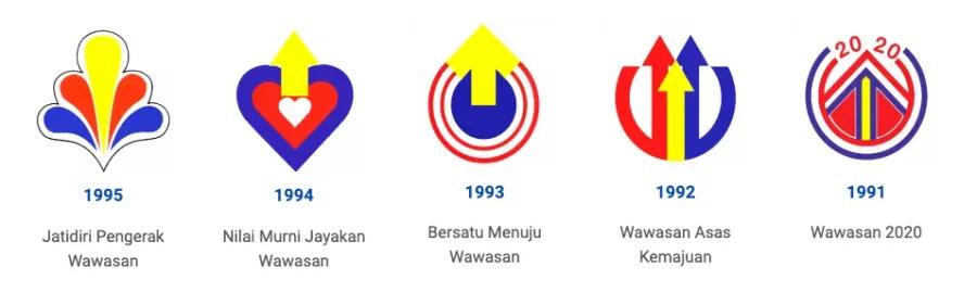
Here, the narratives of development, advancement, and progress (“Kemajuan”) were celebrated and represented through the logos. The symbol of the arrow now takes centre stage and appears more purposeful and vertically oriented. The nation is directed towards a shared vision (or “destiny” in referencing Benedict Anderson), with arrows and elements pointing in a unified trajectory upwards. This new identity signifies a developing and progressing Malaysia, moving forward in a unified direction.
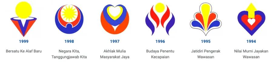
Interestingly, in the mid-1990s, logos began to adopt a more organic visual approach, moving away from the previously geometrically inclined designs. This shift towards a softer and more organic visual tone seems to align with the emphasis on the theme of Moral Values (“Nilai-nilai Murni”).
Fast forwarding through the teen years of the millennium, we witness a few nods towards exhibiting Malaysia as a digital and technologically inclined nation, with the logo of 2017 resembling an app icon and the 2022 logo resembling the WiFi symbol.

In summary, the logos illustrate how visuals as a language project the nation’s consciousness or, at the very least, reflect the narratives imparted by the government of the day, hoping to align the country with a united national identity.
References
1 “Flag of Malaysia.” Mygov is the official portal of the Malaysian government. Accessed October 5, 2023. https://www.malaysia.gov.my/portal/content/138.
2 “National Principles (Rukun Negara).” Mygov is the official portal of the Malaysian government. Accessed October 5, 2023. https://www.malaysia.gov.my/portal/content/30110.
3 “National Flower.” Mygov is the official portal of the Malaysian government. Accessed October 5, 2023. https://www.malaysia.gov.my/portal/content/139.
Kevin Chan Leong Kit
School of Arts
Email: @email
